
mOKGA
MOKGA.com is a personal training website for Julia Lin, advertising her budding business MOKGA
Responsive Website
Role:
UX/UI designer
UX Researcher
The Team:
solo student project
Duration:
1 month
Background
Julia Lin is personal trainer based in San Francisco, CA who is currently in the early stages of building the wellness center, MOKGA. A long time friend of mine, I approached her to collaborate on designing her website to help her visualize and structure how she wants her business and her self online.
The Problem
The current fitness industry does not offer accessible and alternative paths to wellness and personal training.
The Solution
A website focused on conveying a clear brand vision and mission for the future of the business while also allowing opportunities for users to engage in an instant.
Aligning with the client
Before delving into the design process, I synced with the client to align her business goals and my goals as a designer

How did we get here?
1. Research
•
2.Ideation
•
3.Prototyping
•
4. Usability Testing
•
5. Iteration
•
1. Research • 2.Ideation • 3.Prototyping • 4. Usability Testing • 5. Iteration •
Market Research
Its hard to draw a direct comparison between what Julia Lin is trying to achieve with Mokga and existing businesses. Each of the businesses below reflect an aspect of Mokga; Diakadi reflects the fitness aspect, Community Well reflects the community and wellness aspects, and Balay Kreative reflects the culturally accessible and philosophical aspects of Mokga.
-
With a strong client base and a heavy focus on wieghtlifting and physical fitness, Diakadi is displays how a typical fitness center can get through to its clients. Their website provides structred programming and client testimonials to entice potential customers.
-
Community Well offers a vast array of health and wellness opportunities. Appearing to be a resource for those looking for local health and wellness services, the content heavy and clunky UI of the website leave room for improvement. When first exploring the website, it is unclear the intention and purpose of the business itself.
-
Balay Kreative is geared toward the development and representation of a minority community by utilizing many forms of art and revenue, grants, and programs. While their website fully fleshes out Balay’s philosophy, their is not a direct way for user engagement.

The lack of a direct reflection of what Julia Lin’s Mokga looks like, displays how there is a whole in the market that Mokga can fill. From each of these businesses, we can take inspiration from how some use structured information and others use multimedia to entice users into pursuing service.
I interviewed 5 users (interested in exploring their fitness) between the ages of 24-30 over zoom.
user interviews
Key Findings
Here is what I found…

5 out of 5 users:
said the impersonal and unpleasant nature of standard gym practices intimidates them
say that a busy schedule affects their ability to maintain or pursue practicing health and wellness

4 out of 5 users:
users talked about the lack of representation within fitness and the need to focus more on what can genuinely benefit a body/overall health
users value and prefer wellness and fitness spaces with a strong sense of community
Most users expressed a sense of dissatisfaction with their current fitness and wellness experiences. Location, availability and price were noted as blockers for users to pursue service. Another key discovery was that transparency in programming is essential in building trust with clientele
Whether it be their own perceived lack of commitment to fitness or the high price and sterile nature of their current gyms, there is a strong desire within users for a sense of community and attention to overall wellness, not just fitness.
Users said…
“If I could choose I wouldn’t choose a gym. I want to choose more like rock climbing, or gymnastics because it doesn’t feel sterile, I likes community and direction, the gym is mainly self directed.”
— user 1
When you go to gym it is a little intimidating and it makes me not want to go. It’s more male dominated and I’m not sure if people are looking and since I don't know certain machines, I don’t want them to look stuck or like I don’t know what I’m doing.
— User 3
POV & HMW
After interviews, we used this POV and HMW to get in the head of our user
I'd like to explore ways to help busy individuals incorporate creative paths to wellness into their life so that they might find a comfortable place to explore their body because there is not currently a place for this in the current wellness industry.
How might we help busy individuals incorporate creative paths to wellness into their packed schedules because there is not an accessible place for them to do this currently?
Working with a personal trainer is kind of intimidating! I will only do something (fitness/training) if its vetted by someone that I know”
— User 2
Persona
With our user research findings, Sage’s persona was created to represent our user base.
Sage’s persona shows how pain points like budgetary restrictions and a fear of fitness standards impact her willingness to explore her wellness.
Ideation
Sitemap
Working with my client, I began to structure her website centered around her primary business goals.

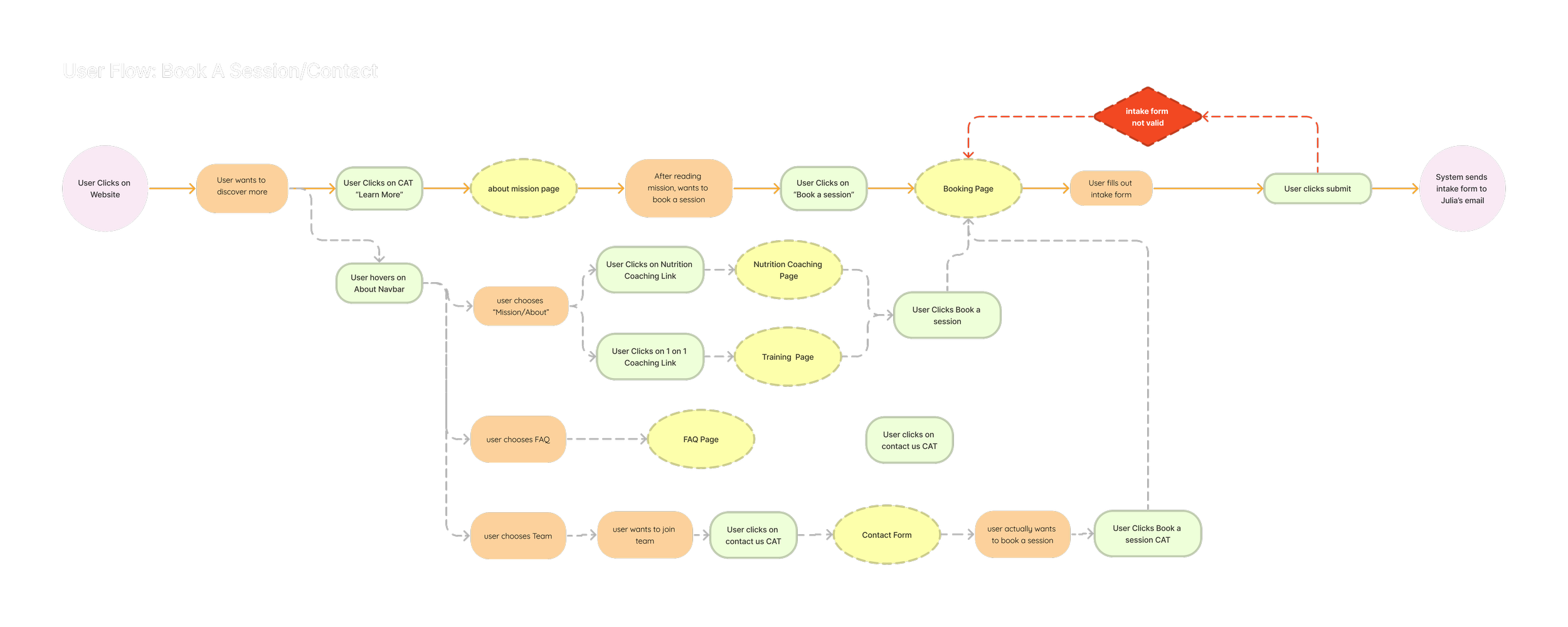
Userflows
Focusing on getting users to book a consultation, this flow shows how the user can book a consultation from various paths of the website.
Wireframing
Low Fidelity
In low-fidelity prototyping, I was able to get a birds eye view of how to best communicate Julia’s vision.
The website would include:
an easy way for the users to get to know the business and what it offers
an events calendar to allow for immediate user engagement
clear presentation of services offered, location and pricing
quick easy booking availability

Adapting for mobile design
Since users began with
Brand & UI Design
Heading into the brand design, the client wanted the business to be
I relied on a primarily grey, white and black color scheme. These colors allow for the content and functions of the product to stand out, by not overpowering them with color.
For the accent color, I chose a dark red with hints of fuchsia. Red is a color often associated with actors, the red carpet and the red curtains of theaters coming to mind.
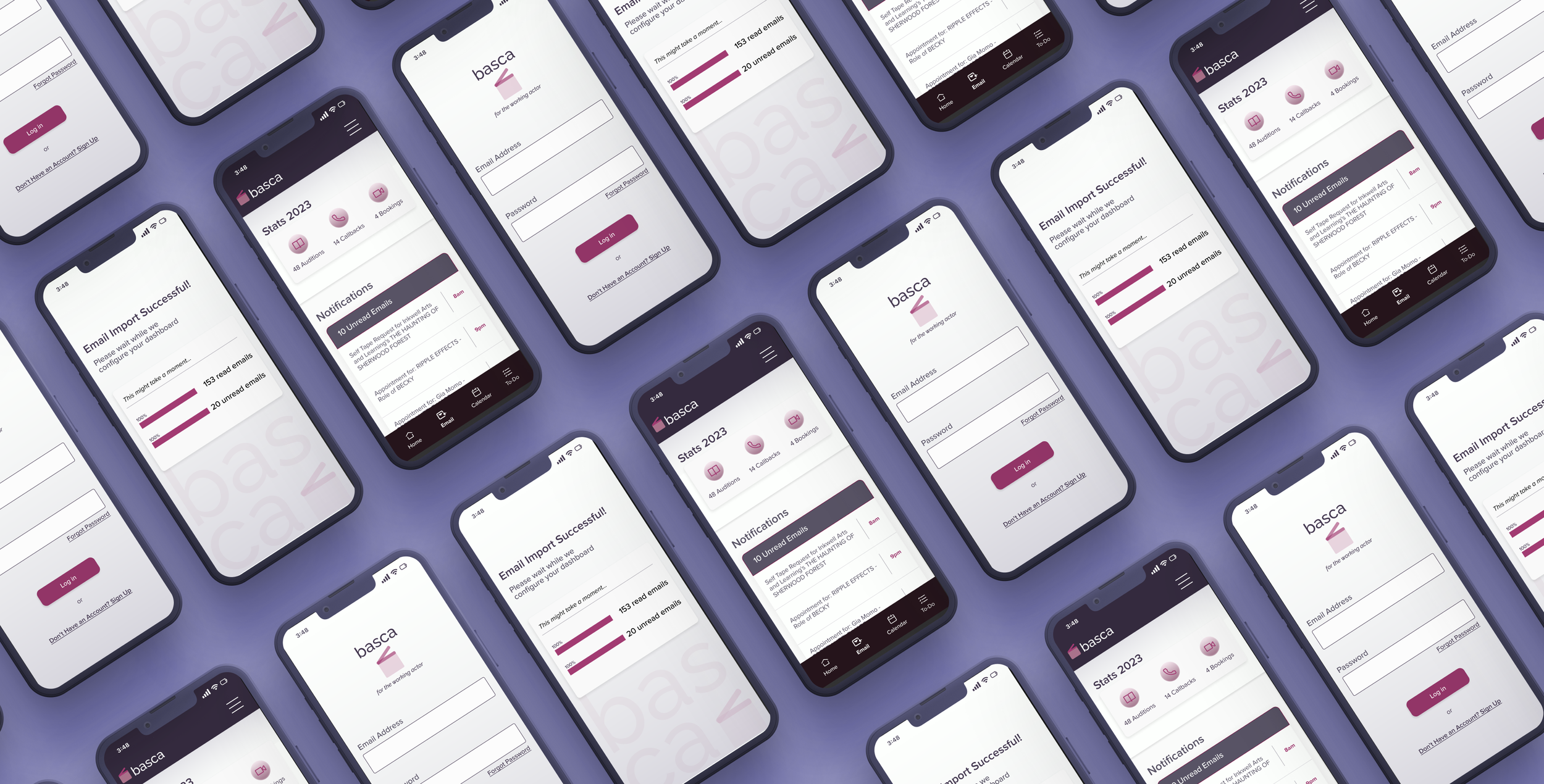
The name BASCA stands for Booking, Actors, Schedule, Casting, Auditions.
The logo draws inspiration for the clapperboard use by production during filming between takes.
RETRO-TO-CHILDHOOD
PLAYFUL
FUNCTIONAL
CALMING

High Fidelity Prototypes
After gathering research from the engineers and crafting brand design we came up with…
Email Settings
I changed the feature from importing priority emails to importing all emails but still allowing the product to categorize tagged emails as priority. This way the user would be able to view all incoming mails, but would allow users to still organize by priority.
Here, the user is still able to tag their talent representative’s email as important so that any emails coming from these aliases would be easily viewable.
Date Detection
Calendar View
The user is also able to add work schedules, acting bookings and any other events.
This feature also allows the user to set priority levels and push notifications to make sure users never miss a scheduled conflict.
From these findings, I deduced that as the primary feature of this product is to link emails to calendar:
The product would focus only on numerical dates to link into clickable dates.
The button next to the links would take the user to the “view in calendar function”
For this view in calendar page, the user is able to view and compare the priority of their different jobs and events. This would give the user an easy way to decide how they would like to reply to their agent.
Testing & Iterations
I tested 3 users over zoom for usability testing
Here’s what I found.
-
![]()
Revision 1
-
![]()
Revision 2
-
![]()
Revision 3


Reflection
This project showed me the limitation of development and taught me the importance of collaboration between engineers and designers. I essentially had to completely change the direction of my design based on the technical constraints of development.
I chose this topic as this was a problem I had experienced in my own life. I strived to make a product that would improve the live’s of actors. An actor’s work lies not only in television bookings, but also the administrative management of their careers. Through my research, I discovered that my problem was one that effected my fellow actors as well.
As there were many pain points and problems that arose from the research, there were also many possible solutions that I could have taken to try and solve it. I had to limit my scope and focus on the problem that I thought I could best solve for. This taught me to be open to iteration and to keep my mind open while ideating. Its best to as throw as many things as a wall and hope just one of them sticks. Then after it sticks, test it and iterate once more.
